The Mother of All Interfaces
In Need of New Metaphors; Projects That Are Rethinking the Operating System
Our Metaphors Are Broken
Since around the fall of 2017, the concept of files and folders has been found subject to a disconnect between students and professors. The older generation has grown quite familiar to the analog metaphor, but not so much the younger one.
Students report seeing the "files" as just everything in one bucket, without clear physical placement. A big reason for that is the shift in how we access files. Newer generations, being more used to search, rarely have to rely on traditional nested hierarchies to find their way.
This shift is similarly observed in the floppy disk metaphor for "saving". Nowadays, practically everything gets instantly synced on the cloud and this symbol gradually loses its meaning. 💾
It's even more than a generational question because just last year we realized a family member hadn't quite grabbed the metaphor themselves, despite computers having been around for 30+ years. I have to mention there is a language factor here because we speak a sort of frenglish in Quebec, so we casually interchange both English and French words like folder, fichier, document, file, dossier.
It's a matter of conceptual models and the file/folder metaphor might just be inherently broken. Such is what Gordon Brander advances. File systems force us into a creative strategy that goes against our natural way of thinking;
"Why do file systems force you to name a file (synthesize), and place it in a folder (organize) before you can write in it (capture)?"
— Unconscious R&D
The very nature of apps being these separate places force us into a workflow where we have to find a place for it and find a name for it before we get to capture an idea. This is completely backwards. Capturing should come first and be seamless, synthesizing should be able to occur opportunistically, and organizing, well, has so much room for improvement that it has become a whole industry (PARA, GTD, Notion marketplace...).
It's fair to say our desktop metaphors have done their time and it might be worth questioning and revisiting them. That's why I get so excited when I stumble upon operating system concept projects and the people who challenge the metaphors for files, folders, apps and how we approach them conceptually. This is precisely what I've gathered below and I hope the list will grow in the future.
Mercury OS
By Jason Yuan @jasonyuandesign
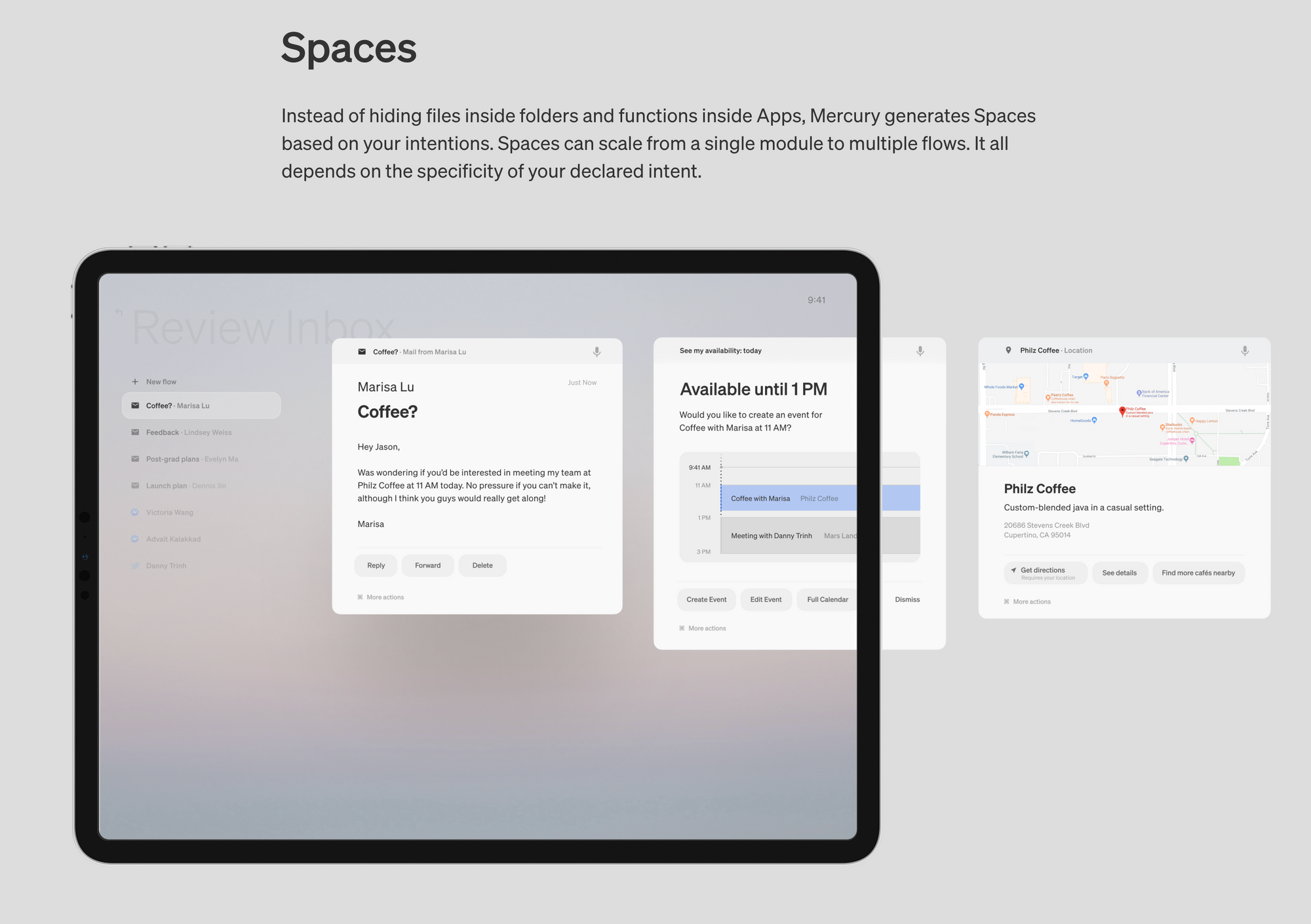
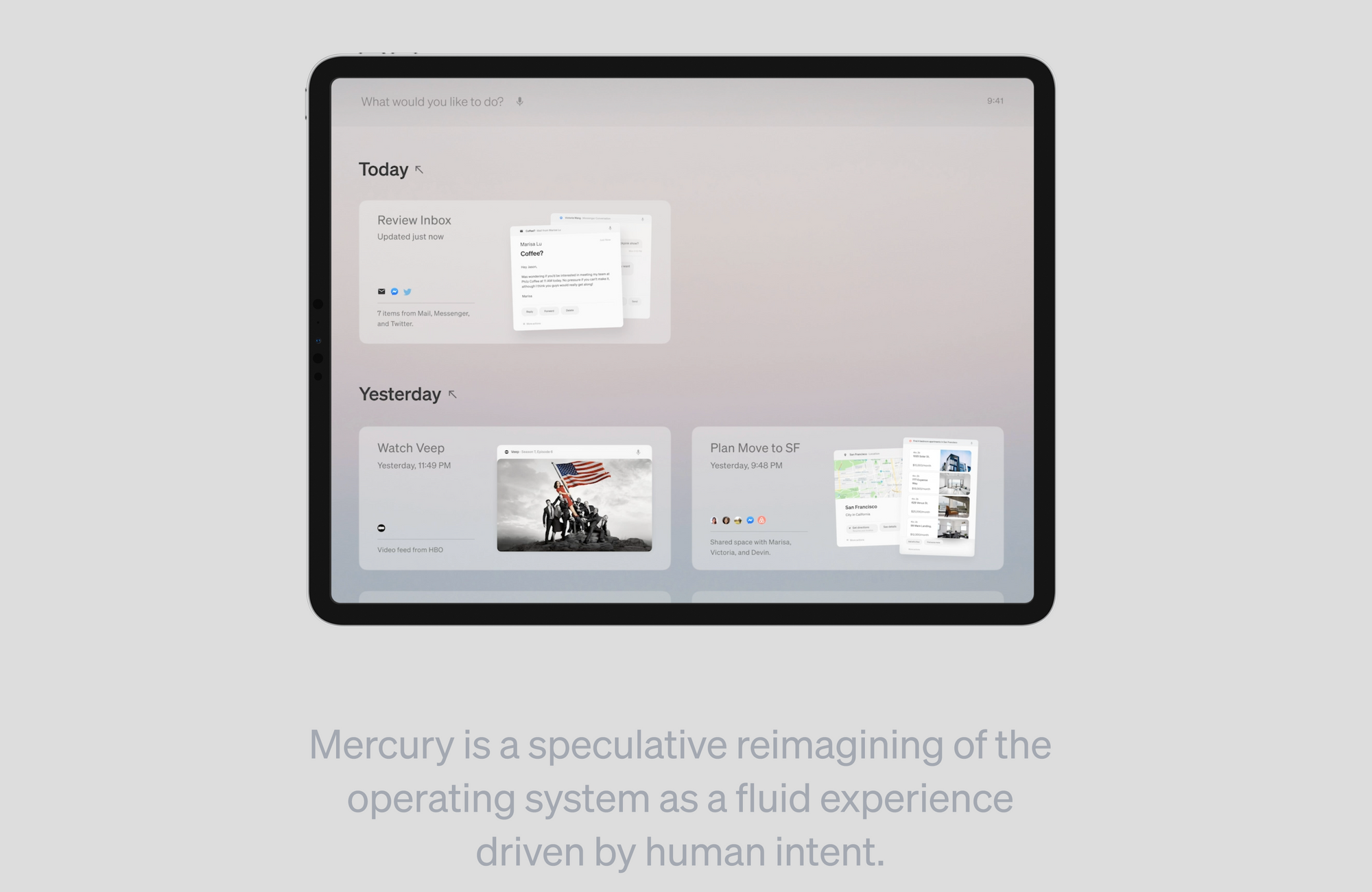
Yuan came at it from an ADHD perspective and proposes that interaction might be about intuitive action flows rather than neatly separated "app" containers.
Yuan's Mercury OS is made up of modules that fluidly appear based on your intention within action flows. These groups of modules eventually assemble into different spaces you get to switch between. The whole OS feels at your service, rather than you needing to click around different environments to find what you need. This approach relies heavily on artificial intelligence and potentially requires a considerable learning curve from the system's side to learn to know your habits.
Desktop Neo
By Lennart Ziburski @ziburski
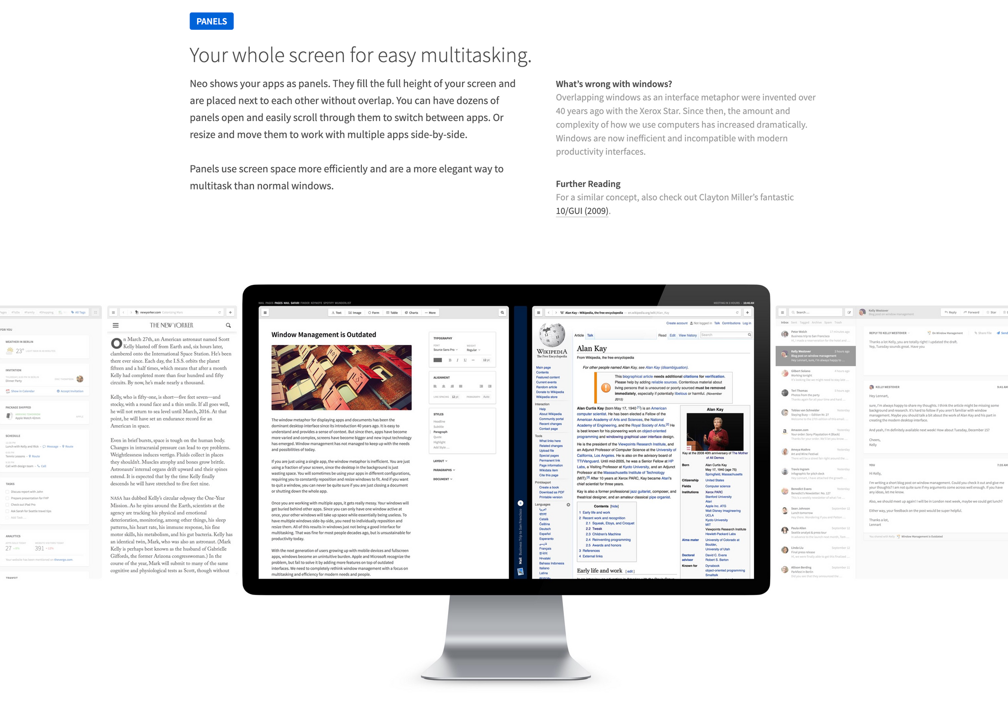
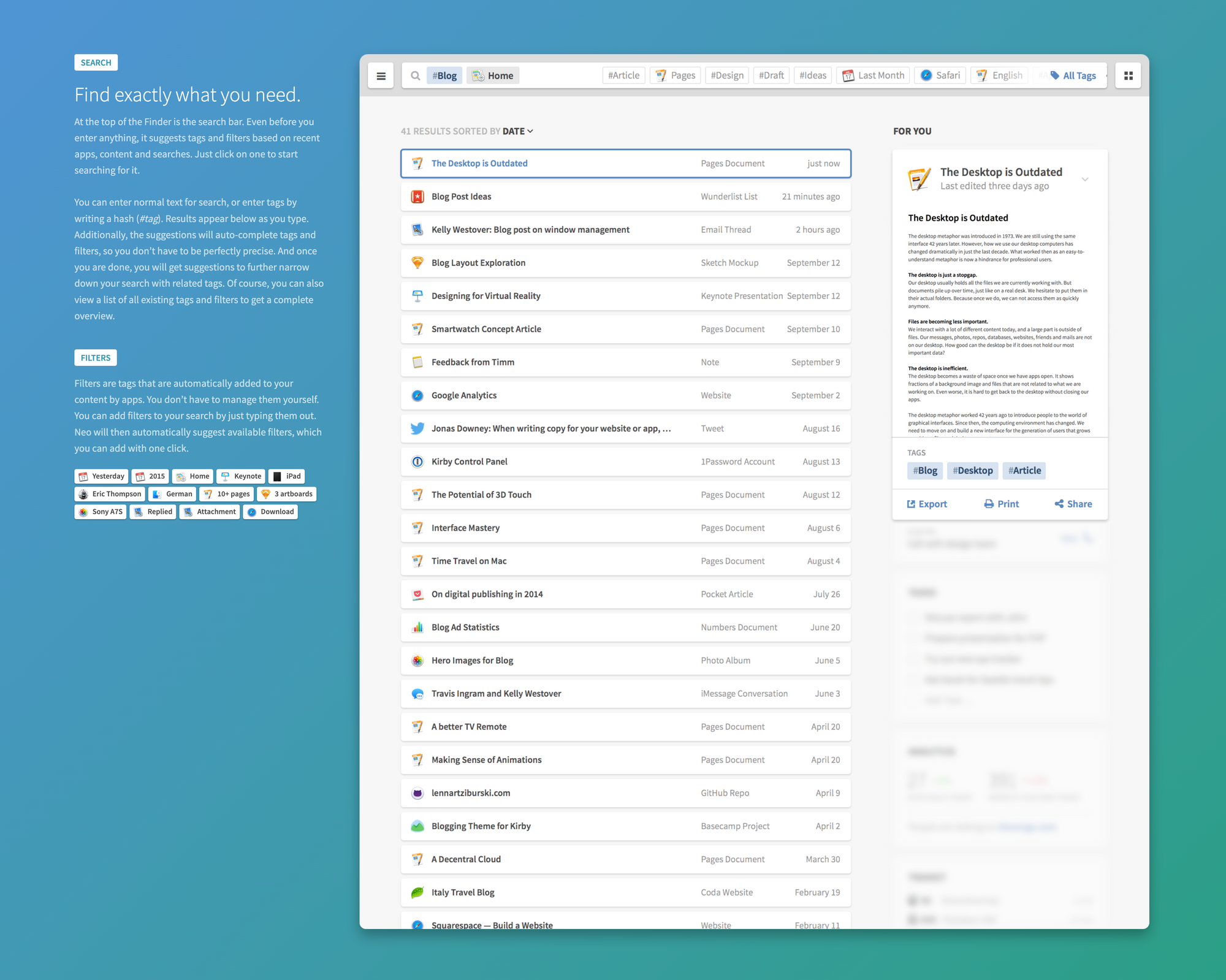
Desktop Neo opts for gaze, touch and voice inputs combined with full-height panels rather than app windows, as well as a tagging system rather than folders in a files-and-links-on-the-same-level type of Finder.

In the Desktop Neo experience, your screen is fully utilized. Apps scale neatly in vertical panels and respond as you need them to stay pinned or minimized. It feels like drafting a linear narrative, a story with the task at hand. Desktop Neo also bets on a principle I often think about; files and links on the same level. In its version of the Finder, you can find relevant calendar events next to recent files next to bookmarked webpages.
Special mention for the input interactions proposed here. Desktop Neo explores a Gaze & Touch interaction where the machine would understand where you are looking via gaze tracking and allow you to just click anywhere on your trackpad to confirm your selection. Would be very curious to try a prototype of that!
Artifacts
By Nikolas Klein @nikolasklein, Christoph Labacher @chlabacher and Florian Ludwig @FloLudwig94.
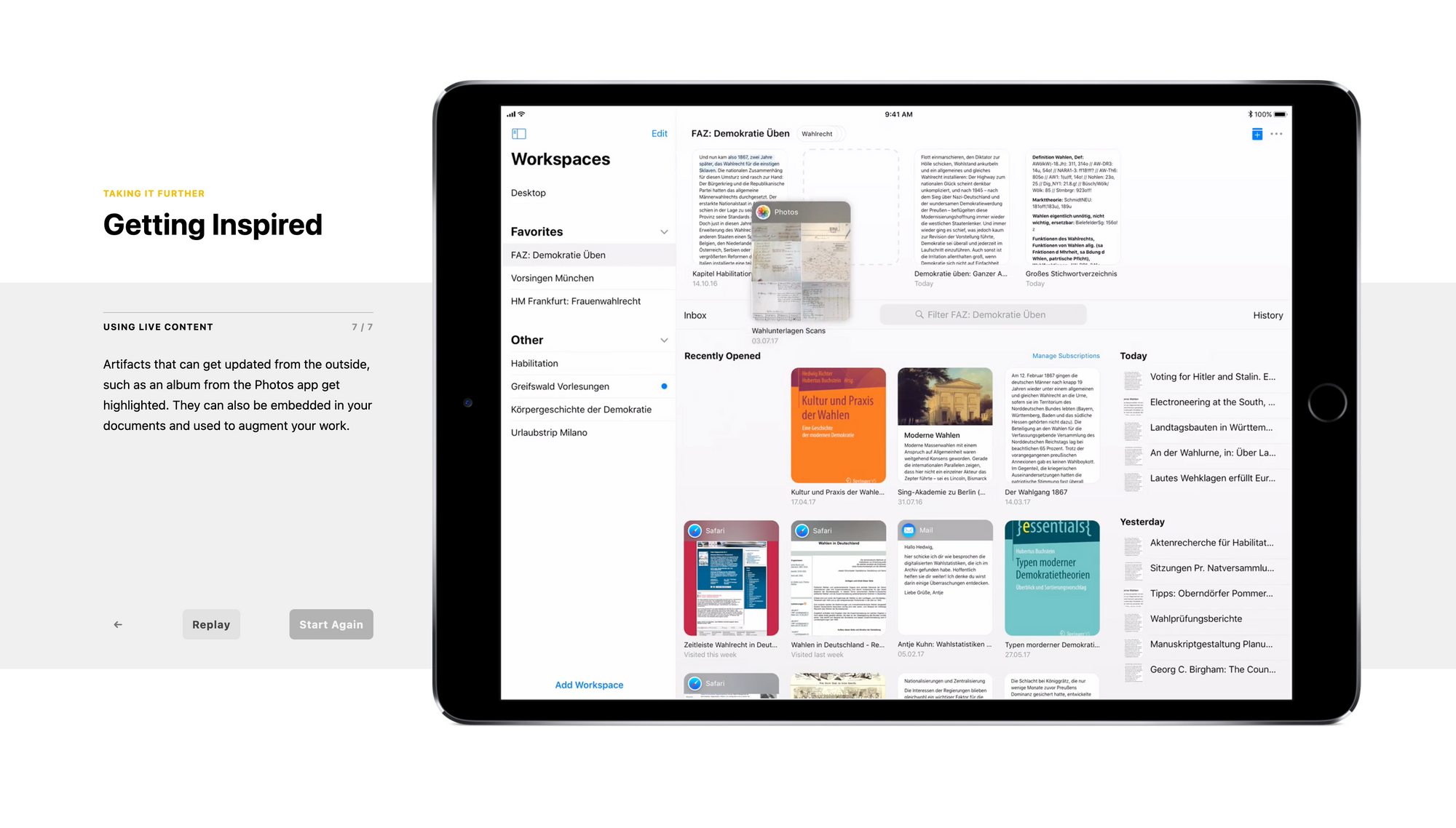
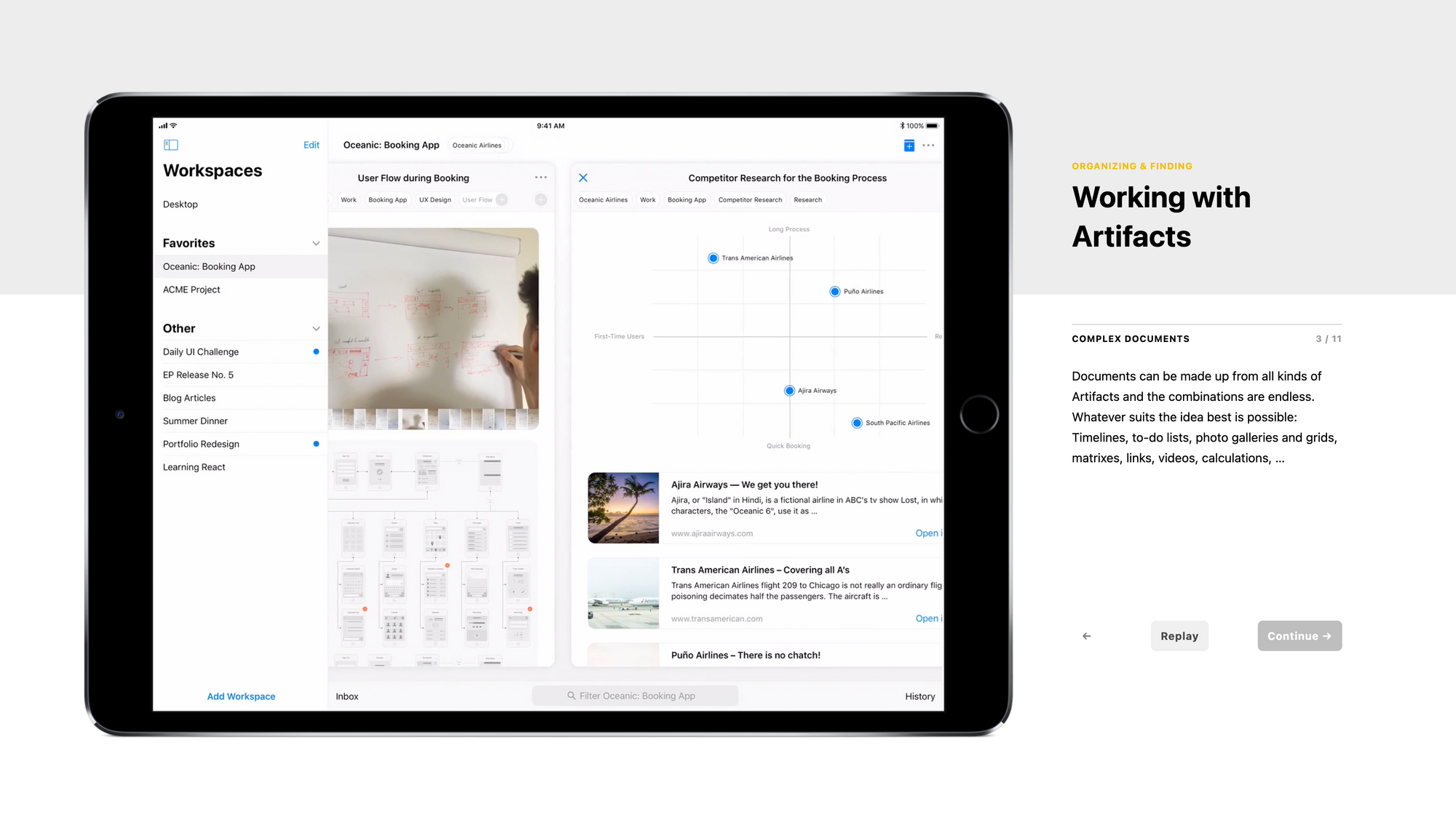
Done as a Bachelor’s Thesis at HfG Schwäbisch Gmünd, the Artifacts iPad app proposes emergence over structure via a single type of document (or a unit of meaning) containing "artifacts" of different media; text, sketch, link, embed, etc.
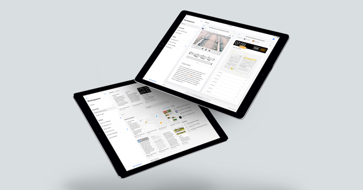
Although not technically an OS concept, this project tackles the very issue of capture-synthesize-organize we looked at earlier. In Artifacts, the base unit is one for capture; documents as units of meaning. It's easy and quick to open a new artifact and input any type of media. No need to select the right app depending on your need for a voice memo, text note, or sketch drawing.
Artifacts scale up in linear arrays of panels, not unlike Desktop Neo, which ends up creating different mind spaces for different projects or tasks.
Interestingly, these three projects bet on the linearity, the narrative thread of our thought process while accomplishing a task or developing a project. Is that the main thing that's missing from our current OSes?


